A scatter plot is a chart type that is normally used to observe and visually display the relationship between variables. The values of the variables are represented by dots.
The positioning of the dots on the vertical and horizontal axis will inform the value of the respective data point; hence, scatter plots make use of Cartesian coordinates to display the values of the variables in a data set.
Plotly Express is the easy-to-use, high-level interface to Plotly, which operates on a variety of types of data and produces easy-to-style figures. Lets plot a simple graph using plotly.express (usually imported as px).
Simple Plotting with scatter
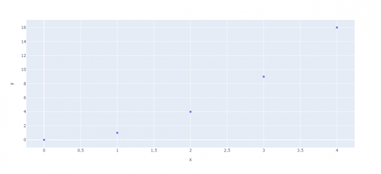
scatter function accepts two lists, one for x coordinates and another one for y coordinates.
# x and y given as array_like objects
import plotly.express as px
fig = px.scatter(x=[0, 1, 2, 3, 4], y=[0, 1, 4, 9, 16])
fig.show()
Run this code and your default browser will open where you will get an interactive graph like this one.
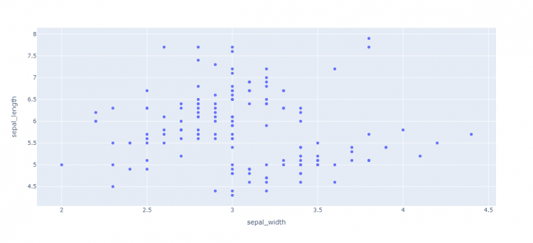
Passing pandas dataframe to scatter
We can use the scatter function to plot the pandas data frame. It accepts dataframe and labels for x and y axis.
# x and y given as DataFrame columns
import plotly.express as px
df = px.data.iris() # iris is a pandas DataFrame
fig = px.scatter(df, x="sepal_width", y="sepal_length")
fig.show()
Run this code and you will get this graph in the browser.
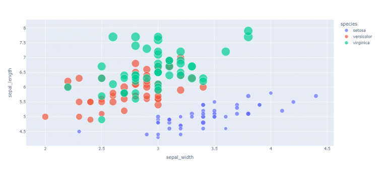
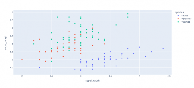
Setting size and color with column names
To plot the graph with variable-sized circular marks, we use the size argument. Note that color and size data are added to hover information. You can add other columns to hover data with the hover_data argument of px.scatter.
import plotly.express as px
df = px.data.iris()
fig = px.scatter(df, x="sepal_width", y="sepal_length", color="species",
                 size='petal_length', hover_data=['petal_width'])
fig.show()
Run this code and observe the difference in the size of circular marks.
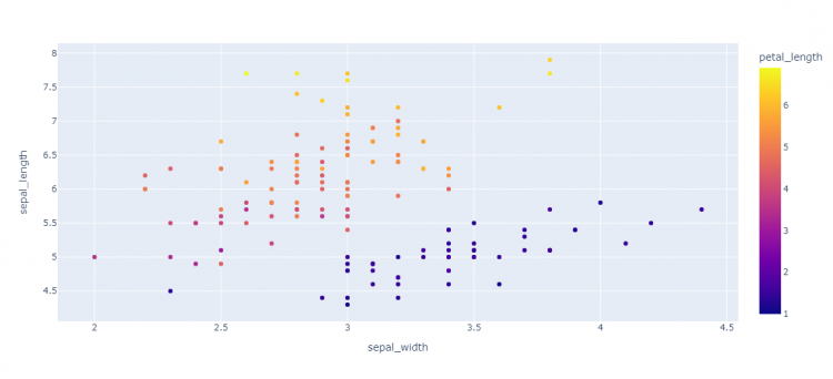
Color can be continuous as follows
import plotly.express as px
df = px.data.iris()
fig = px.scatter(df, x="sepal_width", y="sepal_length", color='petal_length')
fig.show()
Now by just looking at the color, you can estimate the value of petal_length.
Symbol (labels)
Symbols are used to differentiate data from different categories. The symbol argument can be mapped to the column as well.
import plotly.express as px
df = px.data.iris()
fig = px.scatter(df, x="sepal_width", y="sepal_length", color="species", symbol="species")
fig.show()
Different symbols are assigned as per species available in the data.
Scatter Plot And categorical axes
We can present the variable in categorical form such as group like medals.
import plotly.express as px
df = px.data.medals_long()

fig = px.scatter(df, y="nation", x="count", color="medal", symbol="medal")
#to increase the size of circular marks in graph
fig.update_traces(marker_size=10)
fig.show()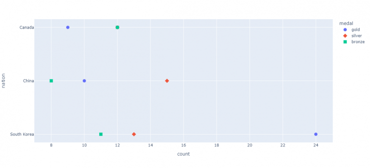
Error bars with scatter plot
Error bars are used to represent uncertainty in data.
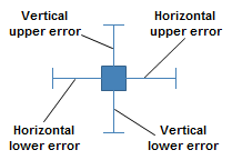
import plotly.express as px
df = px.data.iris()
#adding an extra column in dataframe for using it to plot error bars
df["e"] = df["sepal_width"]/100
fig = px.scatter(df, x="sepal_width", y="sepal_length", color="species",
                 error_x="e", error_y="e")
fig.show()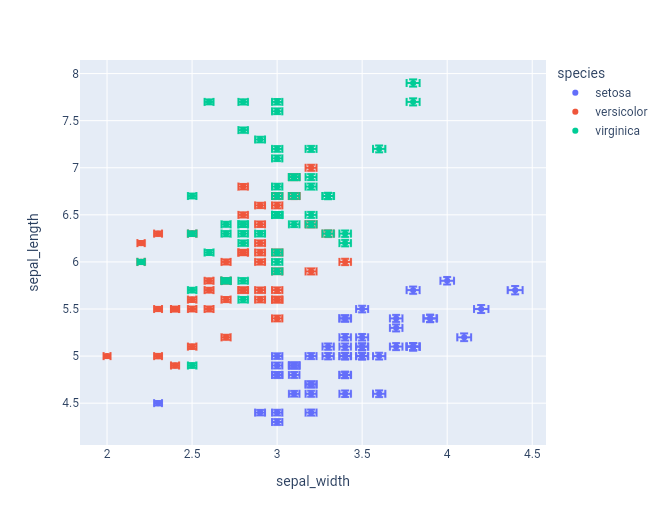
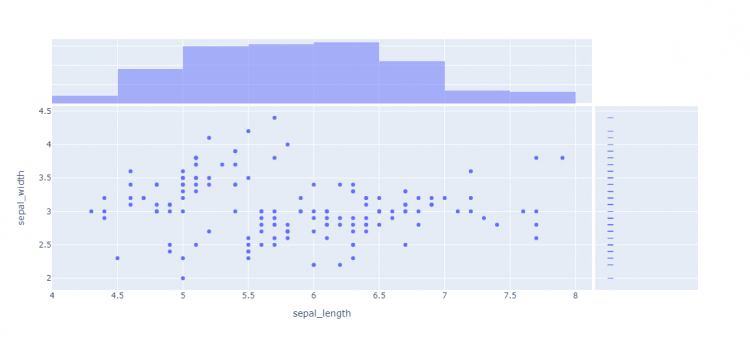
Marginal Distribution Plots
Marginal distribution plots are small subplots above or to the right of the main plot, which show the distribution of data along only one dimension.
Marginal can be ‘histogram’, ‘rug’, ‘box’ or ‘violin’.
import plotly.express as px
df = px.data.iris()
fig = px.scatter(df, x="sepal_length", y="sepal_width", marginal_x="histogram", marginal_y="rug")
fig.show()
The side along the presence of data distribution makes it easier to understand the distribution of each variable.