A box plot is a demographic representation of numerical data through their quartiles(data points divided into quarters). The end and upper quartiles are represented in a box, while the median (second quartile) is notable by a line inside the box.

Box are much beneficial for comparing the groups of data. Box plot divides approx. 25% of section data into sets which helps in quickly identifying values, the dispersion of the data set, and signs of skewness.
Plotly
Plotly is a Python library that is used to design graphs, especially interactive graphs. It can plot various graphs and charts like histogram, barplot, boxplot, and many more.
Submodule in Plotly for Box Plot
Plotly has a submodule called – Plotly Express. Plotly Express is a convenient, high-ranked interface to Plotly which operates on a variety of data and produce an easy-to-style figure.
import plolty.express as pxA box plot created by px.box, the distribution of the column is given as y – argument to be represented.
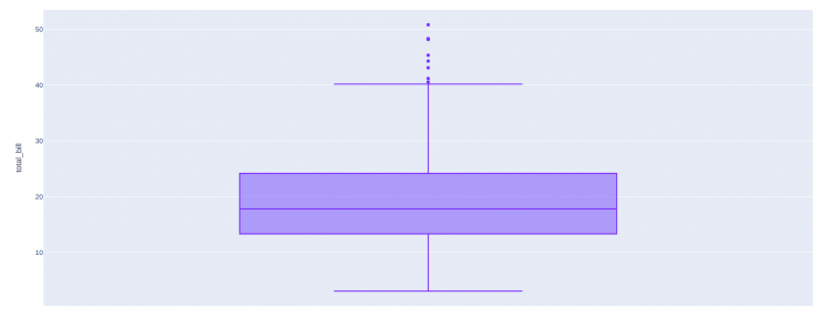
Simple Box Plot
Using tips – data set provided by Plotly express.
import plotly.express as px

df = px.data.tips()
fig = px.box(df, y="total_bill")

fig.show()
Output
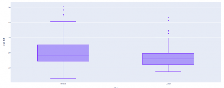
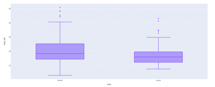
If a column name is given as the x – argument, a box plot is drawn for each value of x.
import plotly.express as px

df = px.data.tips()
fig = px.box(df, x="time", y="total_bill")

fig.show()
Output
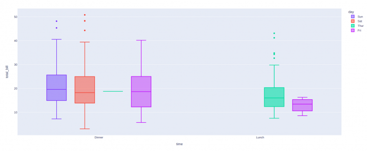
Colouring the Plots
By setting the Color attribute we can configure the colour of the box plot.
import plotly.express as px

df = px.data.tips()
fig = px.box(df, x="day", y="total_bill", color="smoker")

fig.show()
Output
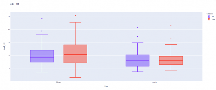
Setting up Title to the plot
import plotly.express as px
df = px.data.tips()
fig = px.box(
df,
x="time",
y="total_bill",
title = "Box Plot", #Setting up title attribute
color = "smoker"
)fig.show()Output
Display the underlying data
With the points – argument, we can display underlying data points. Depending upon the values of the point’s argument we can either display all points (all), outliers only (outliers, default), or none of them (False).
import plotly.express as px

df = px.data.tips()
fig = px.box(df, x="time", y="total_bill", points="outliers")

fig.show()
Output
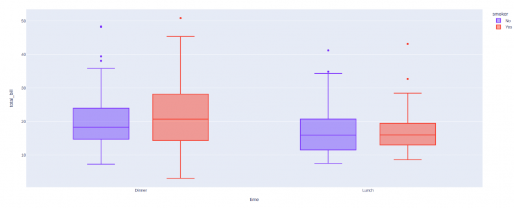
Choosing The Algorithm For Computing Quartiles
By default, quartiles for box plots are computed using the linear method (for more about linear interpolation. However, you can also choose to use an exclusive or an inclusive algorithm to compute quartiles.
- The exclusive algorithm uses the median to divide the ordered dataset into two halves. If the sample is odd, it does not include the median in either half.
- The inclusive algorithm also uses the median to divide the ordered dataset into two halves, but if the sample is odd, it includes the median in both halves.
import plotly.express as px

df = px.data.tips()

fig = px.box(df, x="time", y="total_bill", color = "smoker")
fig.update_traces(quartilemethod="exclusive")
fig.show()
Output
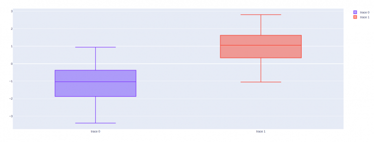
Box Plot with Plotly Graph objects
Plotly graph object is another submodule of Plotly that is used to create various plots.
- Import the plotly graph objects.
plotly graph_objects module is typically imported as go
import plotly.graph_objects as go- Get the data frame to use it in the plot.
import numpy as np

y0 = np.random.randn(50) - 1
y1 = np.random.randn(50) + 1
When using Plotly graph objects first we have to create a figure(i.e a canvas) in which we actually add the plot. For creating a figure we have to just call the Figure() – method of the graph_objects – submodule.
go_fig = go.Figure()- Create the plot – Plotly graph objects has
Box()– method for the Box Plot.
obj_one = go.Box(y = y0)

obj_two = go.Box(y = y1)
Add the plot object to the Figure(or Canvas), for adding the plot into the figure(or canvas) created, we have to use add_trace() – method.
go_fig.add_trace(obj_one)
go_fig.add_trace(obj_two)- Show the plot via
show()– method, using object of the figure created.
go_fig.show()Complete Code
import plotly.graph_objects as go
import numpy as np

y0 = np.random.randn(50) - 1
y1 = np.random.randn(50) + 1

go_fig = go.Figure()

obj_one = go.Box(y = y0)
obj_two = go.Box(y = y1)

go_fig.add_trace(obj_one)
go_fig.add_trace(obj_two)

go_fig.show()
Output
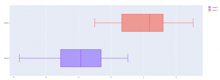
Basic Horizontal Box plot
Creating a horizontal Box plot is almost similar to creating a normal box plot. For horizontal plot – we have to use the X instead of the Y argument.
import plotly.graph_objects as go
import numpy as np

x0 = np.random.randn(50) - 1
x1 = np.random.randn(50) + 1

go_fig = go.Figure()

#Use X attribute instead of Y to make plot horizontal
obj_one = go.Box(x = x0)
obj_two = go.Box(x = x1)

go_fig.add_trace(obj_one)
go_fig.add_trace(obj_two)

go_fig.show()
Output