A table helps in organizing the data into columns and rows. The use of tables is prevalent throughout all communication, research, and data analysis. Tables privilege rapid entrance and proportionately elementary comparison of information.
Plotly
The Plotly library is an interactive open-source library. Plotly makes data visualization and understanding simple and easy.
Submodules in Plotly to create Tables
Plotly supports two submodules for creating tables, that are following:
- Plotly Figure Factory
import plotly.figure_factory as ff- Plotly Graph objects
import plotly.graph_objects as goTables with Plotly Figure Factory
Creating Simple tables
- Import the plotly express module.
import plotly.figure_factory as ff
- Get the data to use it in the table.
First list contains column names
data_matrix = [['Country', 'Year', 'Population'],
               ['India', 2000, '900M'],
               ['Canada', 2000, 27790000],
               ['United States', 2005, 295500000],
               ['Canada', 2005, 32310000],
               ['India', 2010, '1000M'],
               ['Canada', 2010, 34000000]]
import plotly.figure_factory as ffFirst list contains column names
data_matrix = [['Country', 'Year', 'Population'],
['India', 2000, '900M'],
['Canada', 2000, 27790000],
['United States', 2005, 295500000],
['Canada', 2005, 32310000],
['India', 2010, '1000M'],
['Canada', 2010, 34000000]]plotly.figure_factory have create_table – method to creating the table.
fig = ff.create_table(data_matrix)- Show the plot via
show()– method, using object of the plot created.
fig.show()Complete Code
import plotly.figure_factory as ff

data_matrix = [['Country', 'Year', 'Population'],
               ['India', 2000, '900M'],
               ['Canada', 2000, 27790000],
               ['United States', 2005, 295500000],
               ['Canada', 2005, 32310000],
               ['India', 2010, '1000M'],
               ['Canada', 2010, 34000000]]

fig = ff.create_table(data_matrix)
fig.show()
Output

Adding Links to the Tables
Plotly enables to store hyperlinks in the table entries. Create entries the same as how we add in HTML pages.
<a href="https://en.wikipedia.org/wiki/Guido_van_Rossum">Guido van Rossum</a>import plotly.figure_factory as ff
matrix_link = [['Language', 'Creater'],
['Python', '<a href="https://en.wikipedia.org/wiki/Guido_van_Rossum">Guido van Rossum</a>'],
['CPP', '<a href="https://en.wikipedia.org/wiki/Bjarne_Stroustrup">Bjarne Stroustrup</a>'],
['Java', '<a href="https://en.wikipedia.org/wiki/Java_(programming_language)">James Gosling</a>']]
fig = ff.create_table(matrix_link)
fig.show()Output

Inserting Pandas Dataframe into Tables
- Import Pandas module
import pandas as pd- Read CSV file.
df = pd.read_csv('https://raw.githubusercontent.com/plotly/datasets/master/gapminderDataFiveYear.csv')- Select specific columns to insert into the table.
df = df[200:220]Complete Code
import pandas as pd
df = pd.read_csv('https://raw.githubusercontent.com/plotly/datasets/master/gapminderDataFiveYear.csv')
df = df[200:220]
fig = ff.create_table(df)
fig.show()
Output

Tables with Plotly Graph objects
- Import the plotly graph objects.
plotly graph_objects module is typically imported as go
import plotly.graph_objects as go
- Get the data frame to insert it in the table.
countries=['India', 'Australia',
           'Japan', 'America',
           'Russia']

values = [4500, 2500, 1053, 500,
          3200]
plotly graph_objects module is typically imported as go
import plotly.graph_objects as gocountries=['India', 'Australia',
'Japan', 'America',
'Russia']
values = [4500, 2500, 1053, 500,
3200]When using Plotly graph objects first we have to create a figure(i.e a canvas) in which we actually add the plot. For creating a figure, we have to just call the Figure() – method of the graph_objects – submodule.
go_fig = go.Figure()- Create the table – Plotly graph objects has
Table()– method for creating table, it takes two dictionary attributes – header and cells, for column names and columns values respectively.
obj = go.Table(header = dict(values=["Countries", "Vlaue"]),
    cells = dict(values=[countries, values]))
Add the table object to the Figure(or Canvas), for adding the table or any plot into the figure(or canvas) created, we have to use add_trace() – method.
go_fig.add_trace(obj)- Show the plot via
show()– method, using object of the figure created.
go_fig.show()Complete Code
import plotly.graph_objects as go

countries=['India', 'Australia', 'Japan', 'America', 'Russia']
values = [4500, 2500, 1053, 500, 3200]

go_fig = go.Figure()

obj = go.Table(header = dict(values=["Countries", "Vlaue"]),
    cells = dict(values=[countries, values]))

go_fig.add_trace(obj)
go_fig.show()
Output

Customize the table
We can customize the colour of the headers(i.e columns header) as well as the alignment, colour and size of the text in the table.
Table() – method takes header and cell parameters, these have optional parameters fill_color, align and font for setting colour, alignment, and font style respectively.
Setting Header Colors
obj = go.Table(
    header = dict(values=["Countries", "Vlaue"],
                 fill_color = 'yellow'),
    cells = dict(values=[countries, values],
                 fill_color = 'white')
)
Output

Setting Alginment
obj = go.Table(
    header = dict(values=["Countries", "Vlaue"],
                 fill_color = 'orange',
                 align = 'left' ),
    cells = dict(values=[countries, values],
                 fill_color = 'green',
                 align = 'left' ))
Output

Setting up Text color and Size
import plotly.graph_objects as go

countries=['India', 'Australia', 'Japan', 'America', 'Russia']
values = [4500, 2500, 1053, 500, 3200]

go_fig = go.Figure()
obj = go.Table(
header = dict(values=["Countries", "Vlaue"],
fill_color = 'orange',
align = 'left',
font=dict(color="white", size = 12)),
cells = dict(values=[countries, values],
fill_color = 'green',
align = 'left',
font=dict(color="white", size = 12)))go_fig.add_trace(obj)
go_fig.show()Output

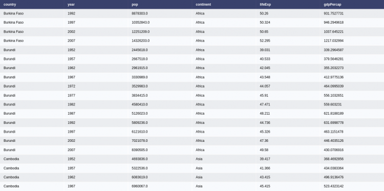
Inserting Pandas Dataframe into Tables
- Import Pandas module
import pandas as pd- Read CSV file.
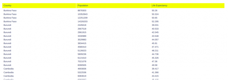
df = pd.read_csv('https://raw.githubusercontent.com/plotly/datasets/master/gapminderDataFiveYear.csv')- Create table Object. Set – header and cells, for column names and columns values respectively.
pd_fig = go.Table(
    header = dict(values = ["Country", "Population", "Life Expectancy"],
                  fill_color = 'yellow',
                  align = 'left' ),
    cells = dict(values = [df['country'], df['pop'], df['lifeExp']],
                 fill_color = 'white',
                 align = 'left')
)
go_fig.add_trace(pd_fig)
go_fig.show()Output

SubPlots in Plotly
Combining Tables and the Chart
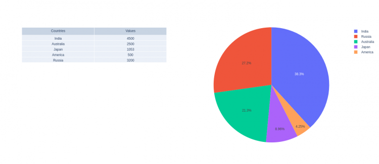
We can display a Table and a Chart together – By creating subplots and adding plot objects to the subplots. Let’s see the step by step procedure:
Plotly has a submodule called plotly.subplots that enables us to create subplots.
- First import the modules:
import plotly.graph_objects as go
import plotly.subplots as sub- Now we have to create the subplot object specifying the number of rows and columns. Also we have to mention type of plots we are going to add into the subplots.
specs (default None): Per subplot specifications of subplot type – A list of dictionary for each row.
fig = sub.make_subplots(
    rows = 1, cols=2,
specs=[[{"type": "table"},{"type": "pie"}]],)- Select the data frame to work with.
countries=['India', 'Australia', 'Japan', 'America', 'Russia']
values = [4500, 2500, 1053, 500, 3200]- Create the table:
table_obj = go.Table(header = dict(values=["Countries", "Values"]),
cells = dict(values = [countries, values]))- Create any plot, let’s say a pie chart:
#pie chart
pie_obj = go.Pie(labels = countries, values = values)- Now add both table and pie chart object to the subplots, mention the row and columns number for each plot object:
fig.add_trace(table_obj, row=1, col=1)
fig.add_trace(pie_obj, row=1, col=2)- Show the figure
fig.show()Output

Add Plots Vertically
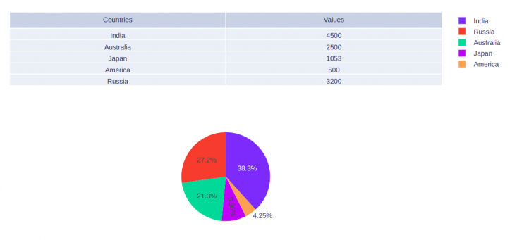
For vertical orientation, we have to configure our subplot.
ver_fig = sub.make_subplots(
    rows=2, cols=1,
    specs=[[{"type": "table"}],
           [{"type": "pie"}]])
Also, we have to now change the row and columns number for each plot to add into subplots.
ver_fig.add_trace(table_obj, row=1, col=1)
ver_fig.add_trace(pie_obj, row=2, col=1)
Complete Code
import plotly.graph_objects as go
import plotly.subplots as sub

#Configure Subplot
ver_fig = sub.make_subplots(
    rows=2, cols=1,
    specs=[[{"type": "table"}],
           [{"type": "pie"}]]
)

#Data Frame
countries=['India', 'Australia', 'Japan', 'America', 'Russia']
values = [4500, 2500, 1053, 500, 3200]

#Table
table_obj = go.Table(header = dict(values=["Countries", "Values"]),
                    cells = dict(values = [countries, values]))
#pie chart
pie_obj = go.Pie(labels = countries, values = values)

#Add plots to the subplot
ver_fig.add_trace(table_obj, row=1, col=1)
ver_fig.add_trace(pie_obj, row=2, col=1)

ver_fig.show()
Output

