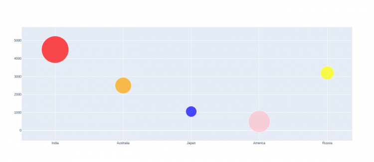
A bubble chart is a type of chart that displays three dimensions of data. Bubble charts can be considered a variation of the scatter plot, in which the data points are replaced with bubbles.
Bubble charts can facilitate the understanding of social, economical, medical, and other scientific relationships.
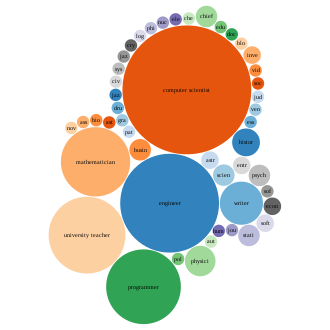
You can use a bubble chart instead of a scatter chart if your data has three data series that each contain a set of values. The sizes of the bubbles are determined by the values in the third data series.
Submodules in Plotly to create Bubble Chart
Plotly supports two submodules for creating various plots such as line plot, bar plot, etc., that are following:
- Plotly Express
import plotly.express as px- Plotly Graph objects
import plotly.graph_objects as goBubble Chart with Plotly Express
Plotly Express is the easy-to-use, high-level interface to Plotly, which operates on a variety of types of data and produces easy-to-style figures.
- Import the plotly express module.
import plotly.express as px- Get the default data frame provided by Plotly to use it in the plot.
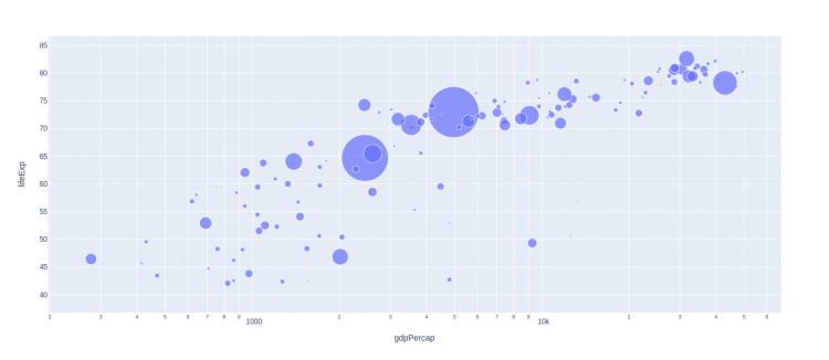
dataFrame = px.data.gapminder().query("year == 2007")A bubble chart is a scatter plot in which a third dimension of the data is shown through the size of markers.
px.scatterfunction accepts two lists, one for x coordinates and another one for y coordinates. The size of markers is set from the dataframe column given as thesizeparameter.
fig = px.scatter(dataFrame,
    x="gdpPercap",
    y="lifeExp",
	size="pop", #Third Parameter
log_x=True, size_max=60)- Show the plot via
show()– method, using object of the plot created.
fig.show()Complete Code
log_x (boolean (default
False)) – IfTrue, the x-axis is log-scaled in cartesian coordinates.
size_max (int (default20)) – Set the maximum mark size when usingsize.
import plotly.express as px

dataFrame = px.data.gapminder().query("year==2007")

fig = px.scatter(dataFrame,
    x="gdpPercap",
    y="lifeExp",
	size="pop", #Third Parameter
    log_x=True, size_max=60)

fig.show()
Output
Add Colour to the Markers
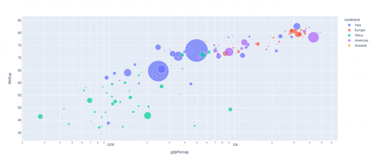
Set the color attribute of the px.scatter() – method.
- color (Series or array-like) – Either a name of a column in
data_frame, or a pandas Series or array_like object. Values from this column or array_like are used to assign color to markers.
import plotly.express as px

dataFrame = px.data.gapminder().query("year==2007")

fig = px.scatter(dataFrame,
    x="gdpPercap",
    y="lifeExp",
	size="pop",
    color="continent", #Color Attribute
    log_x=True,
    size_max=60)

fig.show()
Output
Bubble Chart with Plotly Graph Objects
- Import the plotly graph objects.
plotly graph_objects module is typically imported as go
import plotly.graph_objects as go
- Get the data frame to use it in the plot.
countries=['India', 'Australia',
           'Japan', 'America',
           'Russia']

values = [4500, 2500, 1053, 500,
          3200]
plotly graph_objects module is typically imported as go
import plotly.graph_objects as gocountries=['India', 'Australia',
'Japan', 'America',
'Russia']
values = [4500, 2500, 1053, 500,
3200]When using Plotly graph objects first we have to create a figure(i.e a canvas) in which we actually add the plot. For creating a figure we have to just call the Figure() – method of the graph_objects – submodule.
go_fig = go.Figure()- Create the plot – Plotly graph objects has
Scatter()– method for the Scatter Plot. Set the mode attribute of Scatter method to ‘marker’ inorder to transform Scatter Plot into Bubble Chart.
obj = go.Scatter(
    x = countries,
    y = values,
    mode = 'markers',
    marker_size = [100, 60, 40, 80, 50])
Add the plot object to the Figure(or Canvas), for adding the plot into the figure(or canvas) created, we have to use add_trace() – method.
go_fig.add_trace(obj)- Show the plot via
show()– method, using object of the figure created.
go_fig.show()Complete Code
mode – Determines the drawing mode for this scatter trace.
marker_size – This attributes allows to set the maxsize of the markers.
import plotly.graph_objects as go

countries=['India', 'Australia', 'Japan', 'America', 'Russia']
values = [4500, 2500, 1053, 500, 3200]

go_fig = go.Figure()

obj = go.Scatter(
    x = countries,
    y = values,
    mode = 'markers',
    marker_size = [100, 60, 40, 80, 50])

go_fig.add_trace(obj)
go_fig.show()
Output
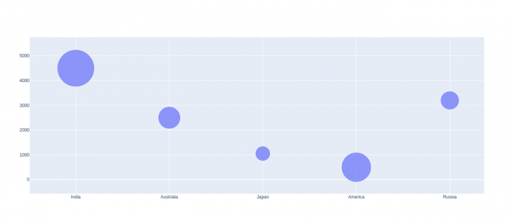
Setting Marker Color
To set the Color of the markers, we have to use the marker attribute of the px.scatter() – method.
marker – marker attributes takes dict with compatible properties.
import plotly.graph_objects as go

countries=['India', 'Australia', 'Japan', 'America', 'Russia']
values = [4500, 2500, 1053, 500, 3200]

go_fig = go.Figure()

col_obj = go.Scatter(
    x = countries,
    y = values,
    mode = 'markers',
    marker =dict( size =  [100, 60, 40, 80, 50],
    color = ["red", "orange", "blue", "pink", "yellow"]))

go_fig.add_trace(col_obj)
go_fig.show()
Output
