Altair is a declarative statistical visualization library for Python, based on Vega. Altair is becoming the first choice of people looking for a quick and efficient way to visualize datasets.
The key idea behind Altair is that users should only focus on the declaration of links between data columns and visual encoding channels (e.g., x and y axes, color, size, etc.) and the rest of the visualization process will be handled by the library (i.e Altair visualization library).
Vega
Vega provides basic building blocks for a wide variety of visualization designs: data loading and transformation, scales, map projections, axes, legends, and graphical marks such as rectangles, lines, plotting symbols, etc.
Streamlit
Streamlit is an amazing technology that turns data scripts into shareable web apps in minutes.
Installation
pip install altair
pip install streamlit
Required Modules
import altair as alt
import streamlit as st
import pandas as pdComponents of Altair Chart
Chart() is a fundamental object in Altair, which accepts a single argument — a DataFrame. The chart won’t do much on its own, till we mention its components – the data, mark, and the encoding.
Data
Altair is built around the Pandas Dataframe, which means that we can manipulate data in Altair the same way we would deal with Pandas DataFrame. There are multiple ways of inputting data like providing the Pandas — DataFrame or CSV formatted text file.
Mark
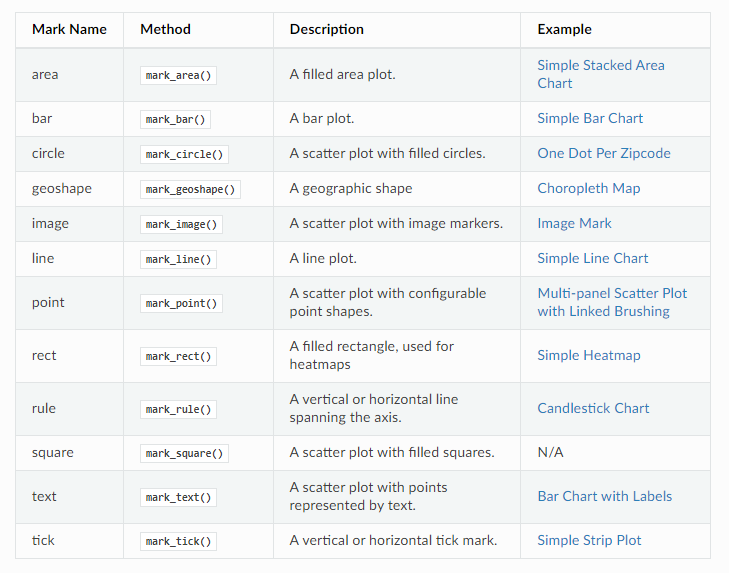
The Mark property is what specifies how exactly the attributes of the data set should be represented on the plot (i.e. line chart, scatter plot, etc). Altair provides a number of basic mark properties:
Encoding
Once we have the data and how it is represented — Next, we want to specify where to represent the data. That is deciding, What data should be in which axes?, What should be the size of the plot, or What should be the color of the plot, etc. This is where we use encodings.
Line Plot
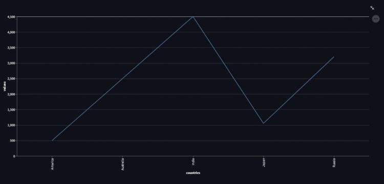
Let us look at a simple line plot using Chart(), mark_line() and encode() methods.
Data Set
data_set = {
    'countries': ['India', 'Australia', 'Japan', 'America', 'Russia'],
    'values': [4500, 2500, 1053, 500, 3200]
}

df = pd.DataFrame(data_set)
Plot
line = alt.Chart(df).mark_line().encode(
    x = 'countries',
    y = 'values'
)
Loading plot into Streamlit application
st.altair_chart(line)Full implementaion would be like this:
import altair as alt
import streamlit as st
import pandas as pd

data_set = {
    'countries': ['India', 'Australia', 'Japan', 'America', 'Russia'],
    'values': [4500, 2500, 1053, 500, 3200]
}

df = pd.DataFrame(data_set)

line = alt.Chart(df).mark_line().encode(
    x = 'countries',
    y = 'values'
)

st.altair_chart(line)
Command to run the streamlit application
streamlit run app.pyapp.py is the file name of the python file we have created so far.
The Streamlit Web App will be available at the following URL:
http://localhost:8501Output
Adding Properties to the Plot
Interactiveness
By adding interactive() method to a line plot object we can make it interactive. Interactiveness means we can now Zoom-In or Zoom-Out in the plot.
line = alt.Chart(df).mark_line().encode(
    x = 'countries',
    y = 'values'
).interactive()

st.altair_chart(line)
Output
Height and Width
Properties() – method helps us to set the height and width of the plot.
<altair-chart-object>.properties(width=500, height=500)Adding Title to the plot
Properties() – method also helps to add a title to the plot.
<altair-chart-object>.properties(title = "The Line Plot")Adding Colour
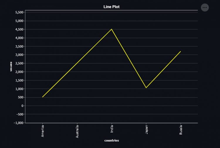
Colour can be added to the plot bypassing the Color argument to the mark method.
import altair as alt
import streamlit as st
import pandas as pd

data_set = {
    'countries': ['India', 'Australia', 'Japan', 'America', 'Russia'],
    'values': [4500, 2500, 1053, 500, 3200]
}

df = pd.DataFrame(data_set)

line = alt.Chart(df).mark_line(color="Yellow").encode(
    x = 'countries',
    y = 'values'
).properties(width = 650, height = 500, title = "Line Plot").interactive()

st.altair_chart(line)
Output
Scatter Plot
For Scatter Plot mark_point() – method is used. Chart() and encode() – method remains the same as the line plot.
Data Set
Altair also allows using vega data sets for practice. Install vega data set using the following command:
pip install altair vega_datasetsVega data sets have various data sets like :
data.stocks()data.movies()data.iris()
You can easily find all available datasets with
data.list_datasets().
Let’s use the iris data set. And we can get insides of any data-set using head() function.
from vega_datasets import data

df = data.iris()
print(df.head())
Output
    sepalLength  sepalWidth  petalLength  petalWidth species
0          5.1         3.5          1.4         0.2  setosa
1          4.9         3.0          1.4         0.2  setosa
2          4.7         3.2          1.3         0.2  setosa
3          4.6         3.1          1.5         0.2  setosa
4          5.0         3.6          1.4         0.2  setosa
The Scatter Plot
scatter = alt.Chart(df).mark_point().encode(x='sepalLength', y='petalLength').interactive()Loading plot into Streamlit application
Streamlit has altair_chart() which enables us to load the Altair charts into the streamlit web apps.
st.altair_chart(scatter)Output
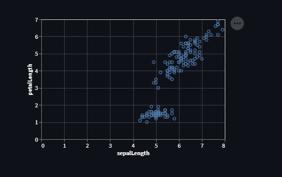
Customizing the Scatter Plot
We can also customize the color, size, transparency of the pointers in the Scatter Plot using altair.Color(), altair.Size() and altair.OpacityValue() methods respectively.
Each of these methods takes a Column name of the data set as a parameter.
- Consider the
altair.Size()– method, the bigger the “sepalWidth”, the bigger the circle. - And,
altair.Color()– method chooses colours at random and the number of different colours depends upon the number of different values in the column passed as an arguement.
df = data.iris()
scatter  = alt.Chart(df).mark_point().encode(
        alt.X('sepalLength'),
        alt.Y('petalWidth'),
        alt.Color('petalLength'),
        alt.Size('sepalWidth'),
        alt.OpacityValue(0.8)).interactive()
st.altair_chart(scatter)
Output
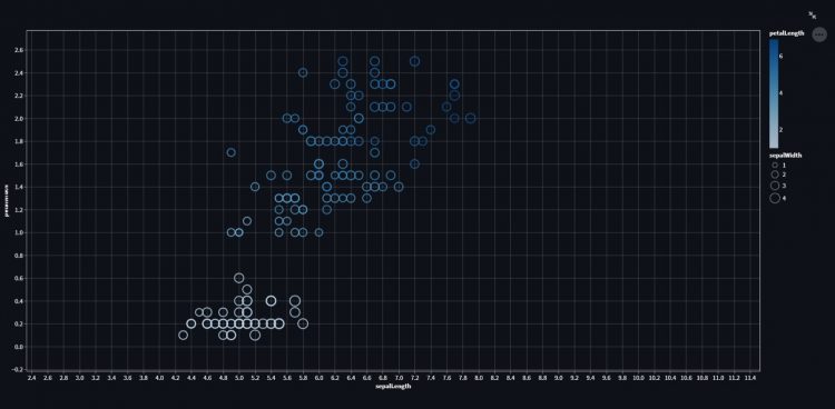
We can also fill the circles in the plot shown above by passing the “filled” argument as “True” to the mark method used.
import altair as alt
import streamlit as st
from vega_datasets import data

df = data.iris()

scatter  = alt.Chart(df).mark_point(filled=True).encode(
        alt.X('sepalLength'),
        alt.Y('petalWidth'),
        alt.Color('sepalLength'),
        alt.Size('sepalWidth'),
        alt.OpacityValue(0.8)).interactive()
st.altair_chart(scatter)
Output
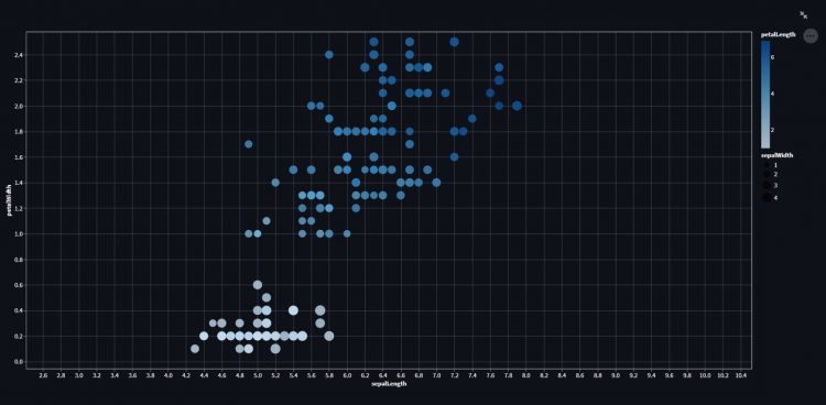
Scatter Plot with Tooltips
Tooltips simply mean when we hover over any circle(i.e. point) in the Scatter Plot, we can see the information related to that point on the plot. You have to just pass the “list” to the “tooltip” parameter of the “encode” method.
- The list passed to the tooltip parameter contains the columns names of the dataset used to plot the chart.
df = data.cars()
scatter  = alt.Chart(df).mark_point(filled=True).encode(
        alt.X('Horsepower'),
        alt.Y('Miles_per_Gallon'),
        alt.Color('Origin'),
        tooltip = ['Name', 'Origin', 'Horsepower', 'Miles_per_Gallon']
        ).interactive()
st.altair_chart(scatter)
Output
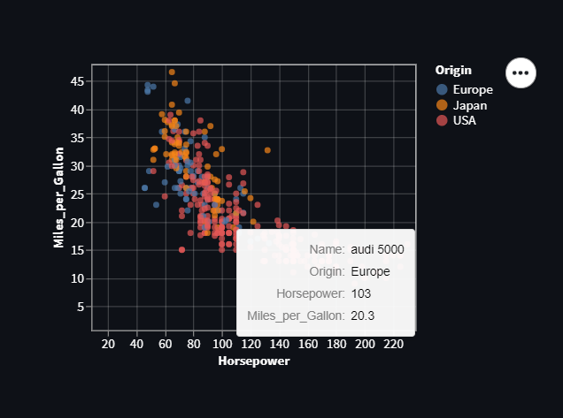
Bar Chart
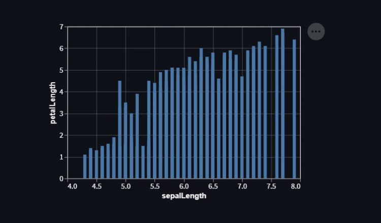
For Bar–Chart mark_bar is used as a Mark method.
df = data.iris()
bar = alt.Chart(df).mark_bar().encode(x='sepalLength', y='petalLength')
st.altair_chart(bar)
Output
Horizontal Bar Graph
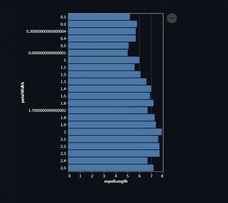
While plotting a Horizontal bar graph(or Chart), everything remains the same as in Bar Graph (Or Vertical Bar Graph\Chart), except we have to change the order of attributes(i.e. Columns) we are using to plot in X and Y axes.
We tend to put the quantitative value on X-axis and we specify the quantitative and non-quantitative value as Q & O.
df = data.iris()
bar = alt.Chart(df).mark_bar().encode(x='sepalLength:Q',y='petalWidth:O')
st.altair_chart(bar)
Output
Adding labels to the chart
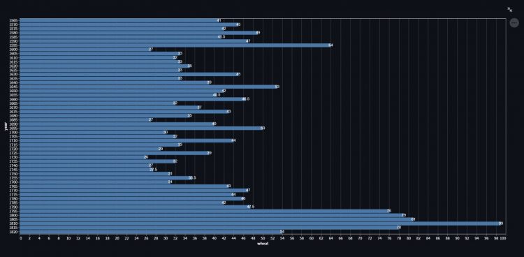
Let’s see how we can add labels at the top of the bars of the horizontal bar chart. Mark_text method is used as a mark for adding text to the plot.
We can add labels to any plot\chart following same procedure.
df = data.wheat()
bar = alt.Chart(df).mark_bar().encode(x='wheat:Q', y='year:O')

text = bar.mark_text(color='white').encode(text = 'wheat:Q')
st.altair_chart(bar+text)
Output
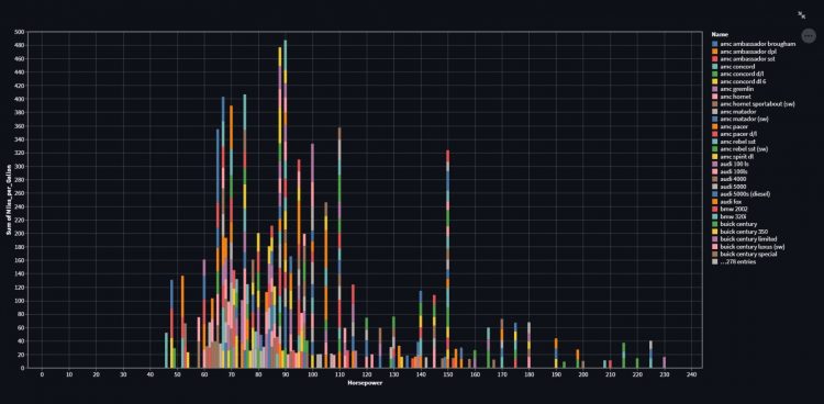
Stacked bar chart
A stacked bar chart(or Graph), is a graph that is used to break down and compare parts of a whole. Each bar in the chart represents a whole, and segments in the bar represent different parts or categories of that whole.
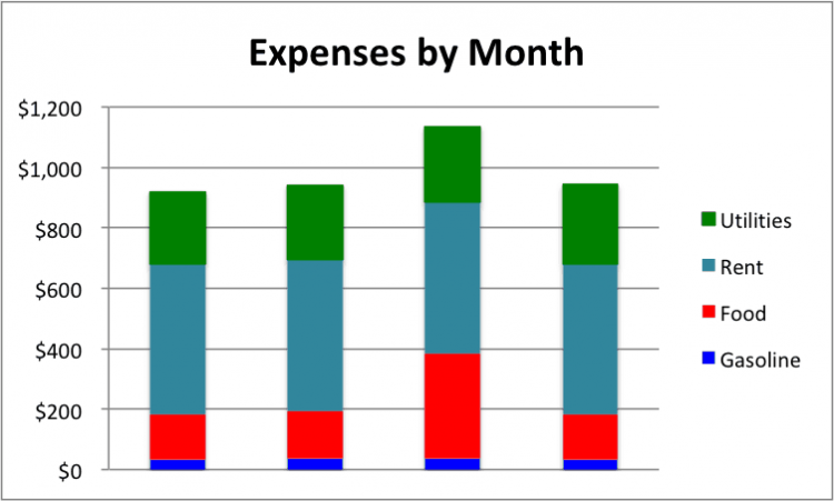
Let’s see how to create a stacked bar graph. We will use the Mark_bar method only as a mark, but here we use an aggregate function (SUM), applied to the columns to be plotted on either X or Y axes.
We can create stacked version of any plot\chart following same procedure.
df = data.cars()
bar  = alt.Chart(df).mark_bar().encode(
        alt.X('Horsepower'),
        alt.Y('sum(Miles_per_Gallon)'),
        alt.Color('Name'),
    ).interactive()
st.altair_chart(bar)
Output
Box Plot
For Box Plot, mark_boxplot is used as a Mark method.
df = data.iris()
box_plot = alt.Chart(df).mark_boxplot().encode(x='sepalLength', y='petalLength')
st.altair_chart(box_plot)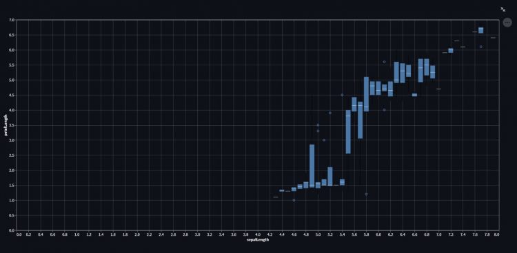
Area Chart
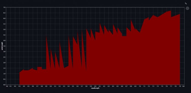
For Area-Chart mark_area is used as a Mark method.
import altair as alt
import streamlit as st
from vega_datasets import data

df = data.iris()

area = alt.Chart(df).mark_area(color="maroon").encode(x='sepalLength', y='petalLength')
st.altair_chart(area)
Output
Heat Map
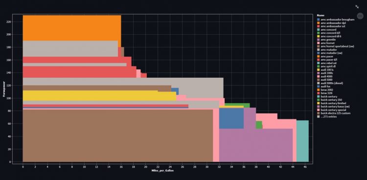
A heatmap (or heatmap) is a graphical representation of data where values are depicted by colors. Heat maps make it easy to visualize complex data and understand it at a glance.

Let us see how to plot a simple heat map using Altair. For heatmap, the mark_rect method is used as a mark.
df = data.cars()
hm  = alt.Chart(df).mark_rect().encode(
        alt.Y('Horsepower'),
        alt.X('Miles_per_Gallon'),
        alt.Color('Name'),
        tooltip = ['Name', 'Origin', 'Horsepower', 'Miles_per_Gallon']
    ).interactive()
st.altair_chart(hm)
Output
Concatenation of Plots
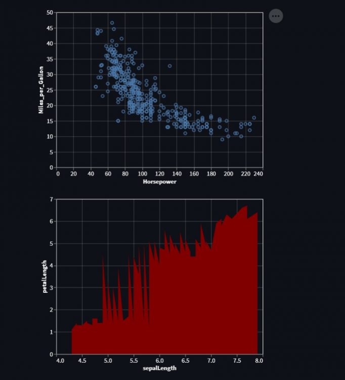
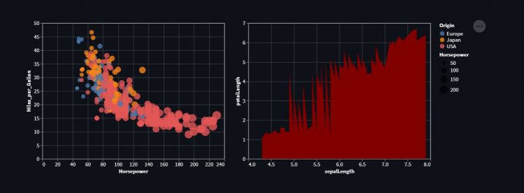
Concatenation of plots simply means creating subplots. Altair provides two methods called altair.hconcat() and altair.vconcat() in order to plot charts in the same line horizontally or vertically.
Horizontal Concatenation
df_1 = data.cars()
scatter  = alt.Chart(df_1).mark_point().encode(x='Horsepower', y='Miles_per_Gallon')

df_2 = data.iris()
area = alt.Chart(df_2).mark_area(color="maroon").encode(x='sepalLength', y='petalLength')

obj = alt.hconcat(scatter, area) #Horizontal Concatenation

st.altair_chart(obj)
Output
Vertical Concatenation
import altair as alt
import streamlit as st
from vega_datasets import data

df_1 = data.cars()
scatter  = alt.Chart(df_1).mark_point().encode(x='Horsepower', y='Miles_per_Gallon')

df_2 = data.iris()
area = alt.Chart(df_2).mark_area(color="maroon").encode(x='sepalLength', y='petalLength')

obj = alt.vconcat(scatter, area) #Vertical Concatenation

st.altair_chart(obj)
Output
